Still looks like a trap!
3rd May 2016 11:48
by Lance Roberts from ii contributor
Share on
Over the last couple of weeks, I have written extensively about the breakout of the market above the downtrend resistance line that traced back to the 2015 highs. To wit:
With the breakout of the market [on Friday], and given that "short-term buy signals" are in place I began adding exposure back into portfolios. This is probably the most difficult 'buy' I can ever remember making.
I also stated that it was probably a trap and that I will be stopped out in fairly short order. But that is the risk of managing money.
It was only a matter of time before the extreme short-term extension of the market begins to correct. Like stretching a rubber band to its limits, it must be relaxed before it is stretched again. The question is whether this is simply a "relaxation of the extension", or a resumption of the ongoing topping and correction process.
Let's take a look at a few charts to try and derive some clues as to what actions we should be taking next.
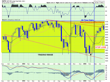
First of all, it is worth noting that, despite all of the recent excitement of the markets' advance, it remains extremely confined in a sideways trading range. This can either be good or bad news.
The good: Sideways consolidations during bullishly biased markets provides the ability to work off excesses built up during the previous advance to provide the "fuel" necessary for the next leg higher.
The bad: Sideways consolidations can also mark the end of the previous bullish advance and the beginning of a bearish decline.
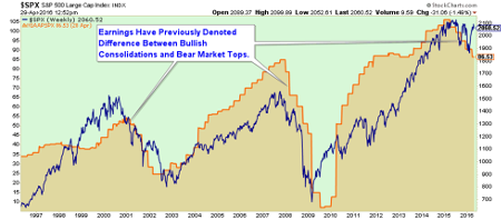
How do we know the difference? Normally, fundamentals tell the story. When earnings are still rising, market consolidations tend to resume to the upside. However, declining earnings have historically marked market topping processes - much as we see today.
Back to our first chart above, I have denoted the previous declining market trend and an adjusted downward trend line to account for the most recent peak. Both of these downward trending price lines will now act as resistance to the next attempt by the market to rally higher.
With the markets still extremely overbought from the previous advance, the easiest path for prices currently is lower. The clearest support for the markets short-term is where the 50- and 200-day moving averages (DMAs) are crossing. I currently have my stop losses set just below this level, as a violation of this support leaves the markets vulnerable to a retest of February lows.
On a short-term (daily) basis, the current correction is still within the confines of a simple "profit-taking" process and does not immediately suggest a reversal of previous actions. As shown in the chart below, support currently resides at 2,040, with the 50 DMA now trading above the 200 DMA.
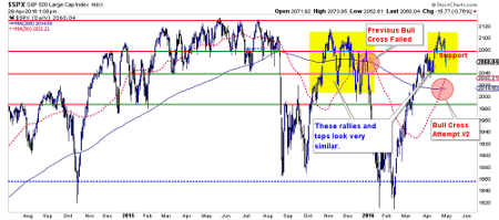
It is worth noting the similarity (yellow highlights) between the current rally and peak versus the rally and peak during the October-through-December advance.
This article is for information and discussion purposes only and does not form a recommendation to invest or otherwise. The value of an investment may fall. The investments referred to in this article may not be suitable for all investors, and if in doubt, an investor should seek advice from a qualified investment adviser.
Lance Roberts is a Chief Portfolio Strategist/Economist for Clarity Financial. He is also the host of "The Lance Roberts Show" and Chief Editor of the "Real Investment Advice" website and author of The "Real Investment Daily" blog and the "Real Investment Report". Follow Lance on Facebook, Twitter and Linked-In